Monday 14 February 2011

Evaluation| Q4. Media Technologies- Production

PRODUCTION JOCELYN


Before filming our teaser trailer, we did test shots, to familiarise ourselves with the equipment so that when we start filming our trailer, it should less time to capture the shots and new skills we have learnt can be applied e.g. camera settings, use of lights and its positions.
Filming our teaser trailer was an exhausting, yet exciting experience. We spent just over two months filming our trailer and the remaining four months were spent editing. We filmed many takes of the same shot, for example the tap shot and the group shot, so as to provide us with a variety of shots to choose from when editing. The fact that we filmed our trailer within our college grounds gave us more control over lighting, e.g. ensuring the lighting in shots remain balanced and high key.


In terms of filming our teaser trailer, our college provided us with the equipment and it was basically down us how we use the equipment to film our trailer, e.g. positions or amount of lighting. We used five main pieces of equipment: a Canon 7D EOS Digital Film Camera, Kinoflex video lights: 400V Diva-Lite and the 2-unit version, tripods for the lights as well as a zoom H2 handy recorder (professional tripod) for the camera.

Canon EOS 7D Film Camera


Professional Camera Tripod


KinoFlo Lights


KinoFlo Lights Tripod


Canon EOS 400D (Photography Camera)


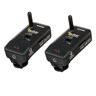
Bowens Pulsar; Radio Trigger


Throughout the filming of the trailer, the setting on the camera remained on Manual so as allow several settings to override each other, which in effect gives us more control over adjusting the settings according to our location, its conditions and the subject we filming. To control the lighting that enters the camera, we adjusted the aperture or ISO. By increasing the aperture, this allows more light to enter and so reducing the aperture decreases the amount of light that enters the camera. We found ourselves reducing the aperture in open areas, where we already had access to natural light not mention the fact we used artificial lighting. In locations that were isolated e.g. the shot with Stacey in an isolated corner required us to increase the aperture slightly. Even with this knowledge of lighting, we still found it difficult to reduce the reflection of the light from the Kino flo lights. In locations that already had natural light entering, using a reflector proved most effective. In dark locations the reflection of light proved very hard to control.


In this behind the scenes shot, the corridor is isolated and lacks natural light, light proves very hard to balance.


 Something we gained more knowledge on is white balance. As the camera has a built in auto white balance imaging sensor, we placed a blank piece of A4 paper in front of the camera lens, so that it recognises the white colour, and maintains the setting. We also adjusted the WB bracketing; +/-3 (three single levels) according to the lighting conditions in the area we filmed in.
In terms focusing the camera, we used a manual focus, and for close-up shots an evaluative focus meter that allows us to decide what we want the focus to be on via the use of spots. This something new we had to learn about. Evaluative focus meter setting was very useful when filming our opening shot. Click the link to see opening shot in our trailer;

http://www.youtube.com/watch?v=WlOmEukRZ4Y

Using the Kino flo 400V and 800 V Diva Lite and the 2- unit version lights was very difficult and took us very long time to ensure the set was lit sufficiently and the main character remains lit and the focus of action. Getting the lights in positions that reduces dark spots in the setting was very difficult, we often found ourselves adjusting the camera setting and moving around the lights, which was a very time consuming process. After filming two or three shots we began to understand lighting a bit more. The Diva Lite’s enabled us to adjust the intensity of the light; we could make lighting the setting dimmer or brighter, the benefit of this is that it helps us avoid the light appearing exaggerated and unrealistic. The Diva Lite’s can also rotate portrait or horizontal, this helps balance the distribution of lighting and allows us to control what direction we want the light to hit Stacey’s face.
The counting in and out at the beginning the end of shots was very important and required the camera person to ; count down from three to one and start filming the shot at two and say action. It was very important, as it marks where the shot starts, to be able to make cuts or changes to shots during editing. The end of each shot was indicated by saying ‘cut’, or indicted by saying something conclusive, e.g. ‘that was great’, ‘prefect’ or ‘cool’ this was also done for editing purposes.

The health and safety of others when using the equipment was a major factor we had to consider and think carefully about when filming our trailer; this was especially important as our test shots and running shots for the trailer were filmed in the corridor. The problem with filming in the corridor can pose a serious risk on students or staff moving in and out of the corridor. What we did to reduce this risk is align the cables by the wall and tried to keep the extension cables in the cable reel, to prevent people tripping over it and potentially damaging our equipment. Something we also had to take into consideration is the set up and the removing of equipment when finished. Before filming we had to ensure the locations for filming were clear and not in use. We filmed all our shots during times when the majority of students are in lessons; this in effect controls the amount of people who may move in or out of our set and also helps reduce any potential health and safety risk. The benefit of us doing test shots meant that when we actually started filming our trailer, it would take a shorter time, which it did and so reduces potential risks posed at people moving around or through our film set. Before using the equipment we had to complete a booking form, which included sections that we had to fill out regarding, possible dangers to us and others that we need to be aware of and where equipment will be used and how it will get to its destination. A booking form had to be completed every time media equipment was required that being; lights, tripods, Canon 7D film camera and Cannon 400D, as there is a limited amount of equipment that needs to be shared amongst media students and is a fair way of distributing equipment.

Photography


We used a Canon EOS 400D to photograph one of our posters; the sink shot and we used the Canon 7D to photograph our magazine cover and our other poster; close-up of Stacey. A Bowens Pulsar; Radio trigger and flash lamp. The 7D camera was used for magazine cover, as it was available at the time otherwise the 400D would have been used throughout. The benefit of using the 7D is that it has a live view and images come out clear and crisp, because of the large variety of settings to choose from in comparison to the 400D.
In terms of lighting, we used a soft box on both our magazine cover and posters, as it helps distribute lighting evenly, in way that the light appears soft, delicate on a person’s face, in this case Stacey’s face. By using a Bowens Gemini Esprit GM 500 flash unit, and connecting it up to the softbox, this effectively enhanced the quality of the lighting and the appearance of Stacey's face close-up. Her face appeared flawless, radiant and soft on camera from the use of the technical equipment.


The poster shots were captured in my media classroom, which is also a studio. The softbox was positioned closer to Stacey and the flash lamp parallel but slightly further away so that the light doesn't appear too harsh on camera. This was also deliberately done to create the effect of Stacey emerging from dark, which will in effect create a dark tone, around our trailer.


Click this post to view our raw posters before photoshop manipulation;
http://motionlesspictures010.blogspot.com/2011/01/film-posters-and-magazine-cover-raw.html


We also used a Radio trigger, which works by sending a signal from the camera to the softbox that triggers the flash (shown above).


POST-PRODUCTION JOSHUA


Evaluation Q3: Poster & Trailer Feedback


The video above contains feedback given by audiences at our college. The feedback given helped us because we were able to identify the different elements of the poster which were successful and some which were not as successful, in bringing across the codes and conventions for the users. Some of these are below:


One of the main props used was the voodoo doll, which was used on one of the posters. The use of depth of field for this image worked to a large degree because this allowed for the audience’s eyes to be first attracted to the prop. This in return created an enigma code for the audience and a sense of want because they question the reason why the prop is in the poster and why it is the most noticeable element of the poster. This is good for the production company because this creates a buzz for the trailer and would cause a higher number of audiences for the trailer.


One of our main objectives (goals) we planned to achieve was to have continuity between the three media text we produced, and as you can see in the video above the use of the green filter for the lighting was noticed by the feedback buddies at college. This is a great achievement for us because the audience decode this effect, in the manner we wished for. Which is that the green filter creates a gritty atmosphere which helps to indirect the sense of death helps to connote the genre of horror.


The use of the captions at the top of the posters helps to give the audience a vague understanding behind the narrative of the trailer. This then helps them to be aware of the genre which is horror due to the captions provide an element of death.


Evaluation| Q3. Feedback

FEEDBACK REGARDING THE FILM POSTER JOCELYN ASEA


Facebook is a very popular social networking site, today and is the perfect platform to use to commuciate to young audiences that being between 16-25, our target audience. Facebook is regularly used by audiences to commuciate with lots friends in a short space of time and allows people to view other people's profile and comment on their profile, e.g. pictures.

We created a group to promote our teaser trailer, which is under the production name of'; Motionless Pictures [Media Group] and contains the trailer, links to the trailer on youtube and the posters.

We used facebook to get feedback on our posters by; tagging random friends, so that the comments are not too similar or biased, asking them to comment on the poster.

The comments that are bolded show positive feedback on specifc features of the poster.


What I have learnt from this feedback, is that according to the comments; the quality of the poster is very good, in terms of; manual focus on the hand, it is a substle detail but yet very effective, the use of a green filter helps to emphasis the use of blood and matches the convention of horror. I have also learnt from my comments that audiences understand the our product and are fond of it and so this may intrigue them enough to view our main product, for which our poster is promoting, that is Hysteria, our horror teaser trailer.


FEEDBACK REGARDING THE FILM MAGAZINE MELISSA MENSAH


Regarding feedback from the film magazine, I decided to collect comments from to highly popular areas which I thought I would generate responses from was Facebook and Blackberry Messaging. These two social networking devices are used regularly by targeted as being within the age range as a media consumer owning a blackberry and Facebook allowed me to be aware of this. Being a media consumer and producer has been quite useful to know how and where to collect information accurately. In the beginning of the project ways in which we received feedback before creating our production finding peoples views and thoughts based around the genre of horror films was conceived through survey monkey. With the use of this feedback engine, it gave us more or less accurate results in regards to our question, but in the number of people who actually filled out the survey was quite small. This was due to lack of advertising and promotion to bring awareness to our audience that there was a survey for them to fill out. I noticed this downfall and improved on it by making sure constant promotion and posts were available for the audience to see many of for them to actually notice. 


In terms of the Feedback i received from Facebook it was quite information I selected and print screened certain people’s feedback as some where more helpful and sensible than others

Looking at the first persons comment Aaron James, his feedback was quite constructive and informative as he linked currently made magazines to this one and spoke about the features my magazine has in order to help me sell the magazine which is one of the most important purposes of a magazine.

The print screen above shows a number of other people’s feedback. As you can see her there were different levels of description and depth of explanation. This is understandable as it shows the level of media that each may be exposed to which will affect there explanation in talking about print media. Also considering that I did publish this I did attract my target market but at the same time I attracted a particular gender which seems to have been a male audience. This is not too surprising but then again is. I say this because females may not really have a thing for horror films but on the other hand we represented our protagonist to be a female but the again the use of excessive blood and gore we used was not necessarily pleasing to the eye.

Blackberry Messenger has become one of the latest era of social networking as it is a faster way to communicate with people through reception at a cheaper price if not on contract. As well as this, all sorts of media can be sent through such as pictures, music, files and voice notes. 
Ways in which I received my feedback from my target was in many ways. I put my magazine as my display picture and updated statuses as a way of alerting my audience to comment and give constructive feedback. As I know some people were lazy I send out broadcasts to people and was persistent in getting feedback. This again only gave me very little responses. I then individually pinged my target market one by one as that was that the only way I knew they would reply. Taking into account I only received feedback from males on Facebook, I made it a point of duty to attract females first to make it sure my reviews weren’t biased.   


Overall, I would say the feedback received from my target audience were roughly fair. I took into account the types of audiences I was receiving feedback from and obviously the structure of response they would have been able to give me. For example some media consumers were not able to express in detail why they liked my media products and what they liked about it. I would say these audience types did not do media or had poorer communication skills in expressing in detail why the did or did not like the magazine. Feedback I received other targeted audiences were either more information rich in order to be exposed to more media than others or either be media producers themselves to be able to give a constructive feedback response.

FEEDBACK REGARDING TEASER TRAILER JOSHUA ADERINOLA 


The video above contains feedback given by audiences at our college. The feedback given helped us because we were able to identify the different elements of the poster which were successful and some which were not as successful, in bringing across the codes and conventions for the users. Some of these are below:


One of the main props used was the voodoo doll, which was used on one of the posters. The use of depth of field for this image worked to a large degree because this allowed for the audience’s eyes to be first attracted to the prop. This in return created an enigma code for the audience and a sense of want because they question the reason why the prop is in the poster and why it is the most noticeable element of the poster. This is good for the production company because this creates a buzz for the trailer and would cause a higher number of audiences for the trailer.


One of our main objectives (goals) we planned to achieve was to have continuity between the three media text we produced, and as you can see in the video above the use of the green filter for the lighting was noticed by the feedback buddies at college. This is a great achievement for us because the audience decode this effect, in the manner we wished for. Which is that the green filter creates a gritty atmosphere which helps to indirect the sense of death helps to connote the genre of horror.


The use of the captions at the top of the posters helps to give the audience a vague understanding behind the narrative of the trailer. This then helps them to be aware of the genre which is horror due to the captions provide an element of death.


Evaluation| Q2. How effective is the combination of your main product and ancillary texts?

ANCILLARY TEXTS OF A FILM POSTER JOCELYN ASEA


From my research into existing film posters, magazine covers and the teaser trailers  I have established there a strong link between them, for that continuity. Film companies will most often connect the production design in their media products via; maintaining the same font style, layout of text, colour e.g. colour filters; green, blue, red and content. This continuity creates a sense of identification and a buzz around the film. 
This is we set out to achieve when creating our poster, magazine cover and trailer. In terms of our ancillary texts for our posters, we strictly kept the font style the same as well as its position,  and all the fonts used in our three products for that; the posters, magazine cover and trailer were retrieved from dafont.com,. Dafont is a website that allows people to download texts free and provides thousands of diverse font styles, that can easily be imported into photoshop to use immediately. The purpose of using the same font style for our throughout our three media products was to create a sense of identification, in order that audiences recognise they are linked and created by the same company. 


ANCILLARY TEXTS


The font style we used in the trailer in terms of the writing of 'Hysteria' is called 'Kolkata Hotelroom'and was retrieved from dafont.com. We choose this font as it compliments the continuity of blood in our products. Notice the tail of the letter ‘Y’; are shown as drips, which is symbolic of the blood in trailer, and effectively connotes suffering and pain.


For our production name; Motionless Pictures, we chose to use a font called 'phatboy', as it looks sleek and clean cut, simple but can easily be read by audiences.


We used a font called 'universal accreditation' for the credits on the bottom of our posters. We chose to use these fonts as it looks professional and sophisticated and is also something that is often used in existing film posters. We kept the font of the credits the same to maintain a sense of continuity and flow.


A Times New Roman font was used for our blogspot link, for the reason that it is the access point for which audiences can watch our trailer, therefore text needs to be easy to read, so that it can be read and accessed by many audiences.
We used a font called 'Awe', as the font looks damaged, broken, rough, demented almost. This can be used illustrate Stacey's (our actress); her thoughts, feelings and appeareance. We also chose to use this font, for the reason that we felt it had a sense of evil about it and it would be represent the genre of our trailer and will correspond well with the photographs used in the posters.


SOCIAL NETWORKING SITES JOSHUA ADERINOLA


Facebook is a well known social site with over 500million users daily, so we believed using this media platform will help promote our media products, in the best way possible.


We used various methods on Facebook to help promote our media products. These methods are:


• Facebook Like Page-


This is a profile page on Facebook, this page is just like a normal profile page for the users. This allows Motionless Pictures to add friends on the like page. This helps to give a wide range of different audiences. The profile page allows Motionless Pictures to upload our print based products (magazine cover and posters).


Which will then be seen by the page friends and users who are also not friends to the profile page. This is a great advantage because the feedback given will be harsh and honest because most of the feedback is given by strangers which Motionless Pictures are meeting for the first time.


• Facebook Status


This feature on Facebook allows Motionless Pictures to send messages to the page followers, this allowed us to embed our trailer onto the Facebook page. For the audiences to view.


Youtube


Youtube is also a well known site; it is a free video sharing website which allows its users to upload videos to its site. We chose to upload our video onto Youtube because we believed it would be the best method of promotion for our trailer.


The use of these to media platforms allowed for use to have a wider audience than expected/possible due to the fact we were able to attract large numbers online without a great amount of difficulty.


ANCILLARY TEXTS OF A FILM MAGAZINE MELISSA MENSAH


There was a strong sense of continuity which reflected on our two film posters and our film magazine. The use of the protagonist being placed in our film poster and magazine was one aspect which contributed to it. Also with in the image, the use of similar, costume, props and make up was used for the audience to relate to the same film. All these aspects contributed to a successful marketing strategy when advertising our film to our target audiences


Evaluation| Q1. In what ways does your media production use of, develop or challenge forms and conventions of real media products?

MEDIA CONVENTIONS OF FILM TRAILER AND POSTER
JOCELYN ASEA
RESEARCH; FILM TRAILERS

Before filming our trailer, we felt it was important to do research into real media conventions, so that we can understand how film producers are able to use conventions to convey genre, build tension and create an exciting and theatrical storyline. The research in effect acts as a guideline, as to what audiences expect to see when watching horror films/teaser trailers. This helped us decide whether we want to support or challenge conventions.

I researched The Ring, a psychological film; paying attention to the use of a blue filter and its effectiveness in creating a chilling atmosphere and feeling of anxiety and anticipation in sections of the film. I also spent time watching the 1999 psychological thriller Sixth sense. This ties in well with our trailers in terms of the portrayal of death; the build up to the climax of the protagonist, for that the young boy seeing the dead bodies and how it made to take audiences by surprise, for example instructmental  What I was most increased in analysing here was the flow of the narrative which leads to the climax, as this section is most relevant to our trailer ideas.  

In addition, I also referred back to my textual analysis to remind myself of the typical conventions in horror films which we could portray in our trailer to have a dramatic and emotional effect on audience e.g. quick cuts, elliptical editing to compress time, slow motion and non-linear arrangement of shots. For my textual analysis I looked at REC2.
Click the link below to find out more about my textual analysis.
http://motionlesspictures010.blogspot.com/2010/10/updated-storyboard.html

RESEARCH; FILM POSTER

Research


Before taking photographs for our poster, we felt it was important to understand the conventions of existing horror posters so that we can create a poster that is eye catching and marketable; one that sells our trailer well and effectively appeals to our target audience. By analysing existing horror posters it helped us decide whether we want to create a poster that supports or challenges conventions of horror posters.

In our research into psychological horrors we discussed the effectiveness of the conventions in The Ring and other pschological horrors. This post can accessed via this blog link;


For our main poster, our protagonist is captured loosely clutching onto a voodoo with blood dripping down from her arm down to her hand. The fact that our female protagonist's arm appears pale, is a typical convention of horror films. Make-up to make character's appear pale is used to portray sickness or death. In our trailer we portrayed both and throughout the film Stacey was made to appear, unstable and unwell. The pale make-up achieved using talcum powder, proved very valuable in the shot where Stacey sees her dead-self. The Talcum powder helped make Stacey appear like a decaying corpse.
 The use of blood is iconic and supports typical conventions in horror films as well as the use of a green filter, which was used to create a feeling of sickness and an eerie atmosphere. The fact that the focal point in the poster is the voodoo doll and Stacey's hand rather than Stacey herself perhaps challenges conventions of horror films. We are usually used to seeing the denotation of a face or body of some sort on a horror poster. We deliberately placed focus on Stacey's hand and voodoo doll to interrogate the audience's mind; causing them to raise questions about the sub genre of the trailer and narrative.
 In addition, by placing focus on something unexpected and peculiar in our poster, it also helps to target niche audiences. By challenging and conforming to some conventions of horror films, this has helped our media products appear less predictable and more unique and exciting to audiences.


For our second edition poster, we chose to conform to conventions of horror posters so as to be able to wider audiences.
From the denotation, the excess use of blood is overwhelming. This was deliberately done to create a feeling of sickness and unease in audiences, in the hope that experiencing this discomfort and sickness when looking at our film poster, will in effect cause audiences express the feeling through word of mouth and so promote our trailer. The whole idea of using sheer gore was to make it iconic of our trailer and to create a buzz around the trailer.
We also supported the conventions of real media texts by maintaining the production design, for that; giving the photograph a green tint in photograph to create the illusion that a green filter has been used, as we did not use one whilst photographing our 2nd poster. This continuity of green being used in the trailer and posters, should help audiences realise that the products are connected and belong to the same institution. This is production design is a typical convention most institutions follow, for example; Dark Knight created 5 posters to promote their trailer, they were linked their posters by colour; a blueish-black, with white light coming in from a distance and ancillary texts. 


In addition, the fact we have used a Caucasian female to promote our products effectively supports conventions of horror films. By using a Caucasian female to promote our trailer, this allows us to target wider audiences including niche audiences. We also supported conventions that relate to femininity as our character has pink hair and is portrayed in our trailer, poster and magazine as vulnerable and fearful and so typically behaves like a girl.

MEDIA CONVENTIONS OF EDITING JOSHUA ADERINOLA
In the first shots of the trailer, the production company logo is shown; this is common for movie trailers, of any genre. For example I analysed the teaser trailer for The Strangers for my textual analysis, which can be accessed via this link; http://motionlesspictures010.blogspot.com/2011/02/textual-analysis-of-teaser-trailer.html

This helps to inform the audience of the institutions involved; this can also create larger audience because this will allow audiences from various other films produced by the same institutions to be attracted to the film even if it is not their preferred genre(s) of film. This is the main reason why we chose to add the logo before the trailer began to help create brand awareness and a buzz for the film.

The use of anchorage in-between some of the shots, is also very common in horror trailers, the main reason why we chose to use this technique for our trailer is the anchorage acts as a narrative for the audience, because there is no voice-over sound, to inform the viewers of what is happening. The anchorage also acts as an enigma code for the audiences, because they tell half of the story but not the full story. This in return leaves the audiences thinking what the other half of the story could entail. For example “A Girl Who Sells Her Soul”, the audience are aware of a female character, but they do not know who she has sold her soul to, they are likely to conclude she has sold her soul to the devil, they would then link the genre of the trailer to horror, and this is one of the conventions we wish the trailer to convey.


MEDIA CONVENTIONS OF A FILM MAGAZINE MELISSA MENSAH


As a group, we decided to link our work quite closely to the conventions of a film magazine but also challenge conventions where we thought we best. As a media consumer and current producer, my creativity was based around the conventional film magazines that I had seen in shops, internet and other sources of media advertising methods used to attract the media.


One particular magazine company which we were inspired by to make our magazine was 'Empire Magazine" The reason being was because they base their front cover around the genres of action and horror. This was a good source of research for us to make a conventional link between our horror genre ad looking at they could be represented to a magazine to attract our target audiences. Baring in mind our genre was based a horror we thought it would be a good idea to base our ideas around 'Empire' and using their Masthead.


One convention which we followed the was the Masthead placed in front of the image. But this convention was only followed according to whether it would disturb the image or not. For example the diagram below shows the two different examples of the Masthead being brought into the front and sent to the back. As you can see the first two examples have images represented in a medium long shot whereas the other two as shown in a extreme close up taking up most of the page making the masthead less distracted when a bigger image is used rather than a smaller one.


When creating the magazine, my group and I thought we would take this into account by looking at the camera shot of our image and testing whether both possibilities of putting our Masthead in front and behind the image.


As our image was more a less a large image represented as a medium close up and didn't disrupt our image we thought we could place our Masthead in front of image instead of behind. Another reason for this is that the make up on our characters face complimented the colour of the magazine so we thought we'd emphasis that as the colour red has a stereotypical link with horror genres.


Friday 11 February 2011