Tuesday 28 September 2010

Sub-Genre Audience Research| Psychological Horrors

Psychological horror is a subgenre of the horror fiction. Other than using monsters, ghosts and vampires like splatter and slasher genres, it relies on character fears, sound effects, and eeriness to build suspense to further the plot. This horror genre consists of less physical harm and rather works on affecting the characters mentally. It is made to create discomfort in the viewer by exposing common and universal psychological vulnerabilities and fears.

The horror comes from within and exposes the evil that hides behind normality of the environment around them. Psychological thrillers can be similar to psychological horrors, but the thrillers leave a different impact on the audience and its uses more mystery and theatrical dramatic scenes.

Another aspect of psychological horror is its use of body horror. This is meant by the graphic destruction or degeneration of the way the body is portrayed. This could develop a feeling of unease to the audience exploiting human fears of the abnormal, disease and suffering amongst others.

A prime example of current successful psychological horror is Paranormal Activity released in 2007. This supernatural horror film portrays the genre as they present their film in a style of found footage, a type of genre filmmaking to create even more tension.


Monday 27 September 2010

Audience Research| Print Media Results


This questionnaire was conducted during my visit to the Tate Britain, and on my journey there. The chart indicates that majority of the public who participated in the questionnaire are 26-34, and I would expect such a result considering the audience research location. 


The chart clearly indicates that an equal amount of male and female participants took part in the questionnaire. The benefit of finding out the gender of my participants allows me to able to draw up conclusions, compare and generalise to the public.


This was asked to find out whether low key or high key lighting to most effective in drawing attention to the horror trailer and which best matches our trailer ideas, in terms of the genre for that psychological. According to the results high key lighting appeals most to audiences and can be used for a sinister and dramatic effect.


This question attempts to discover the perception of participants on the effective use of lighting to create tension within trailers of horror movies to make them more appealing to potential viewers. According to the results, the majority voted yes, meaning that audiences do support the idea that lighting affects the feeling of tension and fear in audiences when watching horror film trailers.


This question, regarding costume, helps me to find out what audiences would perfer to see actors or models wearing on poster and magazine covers. By finding this out, it allows me to understand what costumes appeal to audiences in terms of horror films and can also be applied to the film, for that the costume the main actor wears and the extras around the actor.


I asked participants which prop appeals to them most, so as to find out what prop I can possibly emphasize in the trailer that will draw the attention of audiences. The bloody bag proved most popular. However I am going to chose to go against the highest vote and instead chose to emphasize the voodoo doll as it bares more significance and is more relevant to the trailer rather than the bloody bag. The doll is peculiar and suggests an evil presence, that of whom wishes to contact the spirit of the living and conduct foul wishes.


Participants were asked what horror genre most appeals to them so as to help my group find out what genre audiences are most interested in watching and what we can change in our storyboard to make our trailer draw audiences in. The horror drama genre according to the graph was most popular, is most fitted to our sub-genre which a psychological.

This question in the sense helps us find out what font is most suitable to horror magazine covers; a formal font or informal font. According results, sans serif proved most popular in comparison to serif font.
This question was used to find out how audiences want the actor in the magazine cover or poster to communciate with them, in terms of non-verbal communciation. I chose to explore facial expression as I believe the sheer dominance of a close-up of a face on a magazine cover or poster, best protrays the feelings and emotions of the actor and so give audiences an insight into the possible genre of the film, without giving out too much information about the film trailer itself. According the results, the possesed facial expression recieved the highest results. The chosen facial expression in actual fact supports the genre of the teaser trailer which is pschological/ drama, in which a young girl sells her soul to unidentified man.


Here a photograph of the victim from the trailer proved most popular amongst audiences in comparision to the setting which appears to be less appealing to audiences. The benefit of using the victim for main poster is that it allows the character in the trailer to emotionally communicate with audiences, to make them feel empathy and understand the pain the character maybe feeling.

`

The purpose of asking audiences about the photography on magazine covers in terms of what they would prefer to see on the cover, is that it helps me design a horror magazine cover that appeals to the audience. The choices the public were given in the question reflect the ideas my group and I had for the magazine cover, trailer and typical conventions of a horror magazine cover, e.g. a supernatural person on a magazine cover. According to the graph, the 'half a face seen' photography is most popular. This type of photograph will allow the character in the trailer to communicate with the audience. The fact that the photograph for the magazine cover will be captured using an extreme close-up also allows audiences to understand the role of the character, as well their emotions.
Here I asked participants what images they would expect to see on magazine cover, as a feature in the magazine. This was deliberately asked so as to find out what will be most effective in drawing the attention of audiences and what will appeal to the audience. The behind the scenes shots proved most popular; they are sneek peeks into the trailer and shots of the production of the teaser trailer, perhaps even shots that may not necessarily be used in the trailer.
This question, in a sense, is very similiar to the question about horror plots; this was done deliberately. Here I have offered the names of the films and the question below states the possible plots. The Sixth Sense proved most popular amongst audiences, in comparison to the very successful Saw. I asked this question to find out what genre most appeals to the audience rather than asking the audience directly as I am likely to receive a different result.


These questions were based on our ideas for the horror plot for the teaser trailer. This was to find out which horror plots from the selection best appeal to audiences, in terms of what they are most interested in watching. The options are based on horror films that are popular in cinemas and amongst most audiences, e.g the idea of a vampire plot can be linked to the very sucessful Twilight. The statistics indicate that the horror plot idea of selling your soul was very popular, and will tie in well with our psychological subgenre.


Audience Research| Horror Teaser Trailer Questionnaire Results


My questionnaire was conducted in and out of College; on students, teachers and the public. My Target audience for the Horror Teaser Trailer is 16-25. My questionnaire indicates that 74% of people aged between 16-25 participated in the study. In many ways my research is biased in the sense that it was carried out in an environment where there are primarily students and adults that fall between this age range, hence the low percentages for people aged 44 and above. I chose to carry out my study in college for the reason that it makes distributing and collecting the questionnaires easier.


Notice the percentage of female participants are almost equal to the percentage of male participants, this therefore makes my data more reliable and perhaps more varied in the sense that the male's and female's perception of horror is likely to be very different and so we have a almost equal amount of participants to be able to generalise my results, e.g. female participants perferred the isolated corner in comparison to the male participants who perferred the janitor's closet location.


The purpose of this question is essentially to find out which setting audiences perferred so that we can decide where one of our main shots will be filmed based on the response from the participants. The benefit of the 'isolated corner' being most popular is that the complexity of lighting the set is reduced, as the lighting is focused in a small area, and can therefore give a feeling of loneliness, isolation which can inturn have an emotional response on audiences. Filming in a stairway, given the limited places my group can film in my school for health and safety reasons, essentially means that any stairway or corridor lights must remain on and exits open. This would disrupt with the filming, in terms of people walking pass the set, not to mention the fluorescent lighting that shows up on the camera as yellow, and will therefore result in there being an excess of lighting, which is unbalanced and in turn creates heavy dark shadows.
In this question, I was very specific about the costume of the main character in the trailer, for the reason that we already have strong ideas about the costume we wanted to use in shots and wanted to see if audiences supported this. We asked participants whether torn, bloody clothes appeal to them and according the graph above it shows that 74% of participants said it did appeal to them. This audience research will be used for a shot to show suffering and create suspense.


The purpose of asking participants this question, to help me find out what colours my group can use in the trailer that supports the conventions of horror films; black proved most popular with audiences. The high response of black can be ultilised by using low key lighting to place emphasis on the main actor.

Allowing audiences to choose what filter 'best represents horror films', enables me to find out what colours are most appealing to them and what they are used to seeing in horror films and so in turn gives me the opportunity to represent dramatic scenes in a way that supports the conventions horror films today. The green filter was most popular amongst participants. The advantage of using a green filter is that it emphasizes 'gory' blood and can a create peculiar and chilling atmosphere. People are often used to associating the colour with 'good' e.g. the environment, plants, labs etc it can in effect be used to portray something negative for that death, for an emotional and dramatic response.


Here I asked participants how long they would expect a teaser trailer to be. Participants were given five options to choose from, for that; 35 seconds, 45 seconds, 55 seconds, 60 seconds and 1 min 10 seconds. The timing choices were taken from the research on trailers for our textual analysis and general research. According to the graph 55 seconds proved most popular. I personally feel that 55 seconds is about the correct length for a teaser trailer, for the reason that, you want to introduce audiences to the main character whilst allowing audiences to understand the genre of the film without giving away too much of the trailer. The trailer also needs to be logical even though it is a teaser trailer and relevant to its target audience as well as its genre. The 55 seconds gives my group and I sufficient time to do all those but almost as blinks as if a person were dreaming, unconscious and it is unreal. In addition, whilst doing my research on teaser trailers I found that most horror trailers were about the same length at that some even longer.


I asked participants this question on editing so as to find out what cuts best supports the conventions of horror teaser trailers and what most appeals to audiences. According to the results quick cuts proved most popular in comparison to long takes that is often used for to have an emotional effect of audiences and introduce the characters on-screen to audiences. The benefit of using quick cuts in our horror trailer is that the cuts will be edited to appear like blinks, a mind trick, hence the genre of the trailer; psychological drama.


This was essential to find out; in order to be able to create tension and suspense in the trailer, which can in turn attract a wider audience. It also helps me decide what sound effect should be exaggerated to have an emotional effect on audiences. According to the results heavy breathing was most popular and well be used in the trailer to symbolise fear and anxiety.


I asked participants this question to find the most beneficial way of distributing the audience research questions and collecting results, using technology today such as; the internet, social networking sites i.e. Facebook, Twitter and Myspace, using social networking sites and devices such as Ninetendo DS, Blackberry messenger and PSP. Technology is heavily used by young audiences today, and so it is a highly appropriate way of contacting mass audiences to retrieve information on horror films from.

I decided to ask whether, audiences use any social networking sites or devices so that participants who do not use any social networking sites or device do not feel pressured to give incorrect answers, and also to find out whether submitting my audience research online will allow me to communciate with my target audience and gain their responses.


The graph indicates Facebook is by far the most used social networking site. By analysing each response, I have also concluded that facebook is heavily used by the audiences between 16-25 in comparison to other age groups e.g. 26-35.

Weekly Update

This week we are focusing on uploading our results for the questionnaire and documenting it on blogger, and doing audience research on psychological horror trailers so as to find out and understand the conventions of a psychological horror trailer.

Thursday 23 September 2010

Audience Research| Print Media Questionnaire

What do you think should you be most dominant on a horror poster?
The setting                         Victim                   Villain 
What type of lighting do you feel is most effective in a horror poster?
Low Key               High key
Does lighting have an effect on the element of fear in a horror poster?
Yes                         No 
What type of clothing do you feel is most suitable for a Horror poster?
Gothic                            Punk                      Causal              Supernatural Costume
Which props appeal to you most in terms of horror posters?
Voodoo doll                   Bloody bag               Broken Glass
What facial expression is most represents Horror films?
Fierce                            Possessed                    Depressed          Emotional
Which would you prefer in terms of a Horror Magazine cover?
A range of colours         A limited range of colours
 What images do you expect to see on a Horror magazine cover?
Make-up shots            behind the scenes          the set               Props
What appeals to you most in terms of the photography on Horror magazine covers?  
The use of a prop       A supernatural person      Half a face seen        A Bloody person
Which of these films most appeal to you?
Saw                                The Ring                               The Sixth Sense
 Which Horror plot appeals to you?
Serial Killer                  Selling your soul                               Vampire                               Psycho

Wednesday 22 September 2010

Audience Research| Horror Teaser Trailer Questionnaire

How old are you?

16-25 26-34 35-43 44-52 53+

What is your gender?

Male Female

Which location appeals to you most in terms of dramatic scenes? Choose one

An isolated corner Stairway Janitor’s closet

Which setting appeals to you most in terms of horror films?


Indoor Setting Outdoor setting


What type of lighting do you feel is most effective in a Horror Trailer?


Low Key High key


Which colours best represent Horror in dramatic scenes?

Choose one colour from each category.

Category 1; Red Green Black

Category2; Green Filter Red Filter Yellow Filter


Do torn, bloody clothes appeal to you in terms of horror trailers?

Yes No

What facial expression is most represents Horror films?

Fierce Possessed Depressed Emotional

Which types of props appeal to you most in a horror trailer?

Voodoo doll Weapon Bloody rucksack Antique Jewellery

Which horror genres appeal to you most?

Thriller Supernatural Horror Drama Horror Comedy

Roughly long do expect a Horror teaser trailer to be?


35secs 45 secs 55 secs 60secs 1 min 10 sec


Which type of characters appeal to you most?


Vampires Physiologically Troubled Mutated animals/ humans Zombies


In terms of Editing in horror trailers, which do you prefer?


Quick Cuts Long takes Jump cuts


Which sounds do you think are most effective in creating tension in horror trailers ? Choose 2


Heartbeats Footsteps Heavy breathing Screams

Audience Research| Film Institutions

     (at least 2 to be able to compare and contrast, talk about their logo, how they disturb films, what technology methods they use and how they attract audiences and a conclusion)

Tuesday 21 September 2010

Textual Analysis of a Film Magazine - Empire

Magazines, along with newspapers, have long been an important part of the media industry. Most magazines give news, interviews, gossip and more on a specific subject. Empire is a British film magazine published monthly by Bauer Consumer Media. The issue discussed below is that of October 2002.


The masthead is the same font, size and location in almost all issues of the magazine. This is done so that the magazine is instantly recognizable and unique and works as a logo as well as a title. The font used on the magazine cover is a serif font. The masthead in this case is red with a white background. This is to fit in with the colour scheme of the issue, which is used to match the cover story of the issue, which is ‘Red Dragon’ of the ‘Hannibal’ series. Since red is in the name of the film it seems appropriate to show it in red font. The main cover line is also large. It is positioned at the lower left and centre of the magazine cover so that it does not interfere with the main image and is the typical location for it in most magazines. Also in the main cover line is a sentence to add more detail to the story. The choice of words again is intended to attract an audience. Naming the lead actor, Anthony Hopkins, will automatically draw in more fans of his movies. The phrase ‘one last bite’ is a reference to the plot of the film, which is about a cannibal. Next to the main cover line, in black font with a yellow background laid out to look like a sticker, the text says ‘world exclusive’. This is a common technique used by magazines. It is appealing to the audience and makes them more likely to buy the magazine if they believe they will be reading some exciting, completely new information and this would be the only magazine to read it.

On top of the ‘M’ in the masthead is the dateline and price of the magazine. These are smaller because they are considered to be not as important as the rest. Regular buyers of the magazine will know and accept the price, while a common reason for showing the price in smaller font is so that the audience is drawn in to want the magazine before they are influenced by its price. The barcode likewise is standard and appears at the lower left corner of the cover. The selling line appears just under the masthead, in a smaller font and in black. It reads ‘the UK’s no.1 movie magazine’. The selling line is used to make the magazine more attractive to the audience; describing it as the ‘no.1’ magazine tells the audience that it is the best choice. Text is laid out at the top, bottom and on both sides of the magazine, but the left third seems to contain most of the information, including the two smaller images and part of the masthead and main cover line. The left third is important for the magazine because of the way magazines are laid out in shops – the left third is often all that is seen so a magazine must stand out and be easily recognizable.

Other cover lines also work to attract the audience. The cover line about the film ‘Signs’ makes references to the Sixth Sense, mentioning the title instead of the actor and parodying the most famous line with the phrase ‘I see aliens’.
Another cover line states ‘win a part in a movie’ and mentions a ‘£20,000’ prize. These lines will also aid in persuading consumers to buy the product because this is an offer that will appeal to a wide audience. People will be more likely to buy something if they think they can get something from it.
A cover line in the top right corner stands out for its location as well as its colour scheme being yellow and white with a black background, saying ’40 pages of new films and DVDs’. This will appeal to a wide range of film fans and the inclusion of the number makes the audience believe that they are getting a good deal out of it.
Above the masthead the tagline also mentions a ‘TV Special’ which also widens the potential audience, particularly as it lists a variety of television programmes that will appeal to different audiences (Buffy, 24, the Sopranos). There is also a smaller image of the lead actress from ‘Buffy’.
At the bottom of the cover is another cover line with a larger font announcing the ‘full story’ for the second Harry Potter movie. Phrases such as ‘full story’ also appeal to the audience more and persuade them that they are getting more for their money. A small image is also included with the cover line.

The main image is a photograph of the actor Anthony Hopkins from the Hannibal film series. It is set so that his face is perfectly centred on the page and seems to be making eye contact with the viewer. A red filter is used and the image is low key and lighted artificially, giving an unnatural glow to his face. His expression is in character and attempts to give the same effect as watching the character in the film.

Monday 20 September 2010

Textual Analysis of a Film Poster - The Strangers

Since films have been shown, film posters have been created to promote them. They started out simply as cards handed out inside a movie theatre, and by now are displayed in many locations, including outside and inside cinemas, on billboards, in magazines, flyers and websites and may come in a number of sizes. They typically consist of a single picture and text, including the title of the movie, the tag line, and some production information. Studios often print several different posters to appeal to different audiences, particularly for advertising internationally.

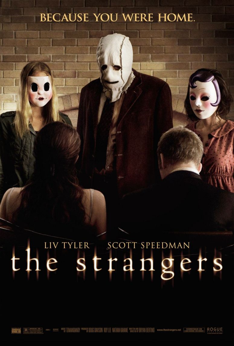
The film posters I have been looking at are for the American thriller horror film ‘The Strangers’. Rated 15 in the UK, the film was written and directed by Bryan Bertino and produced by Rogue Pictures, Intrepid Pictures, Vertigo Entertainment and Mandate Pictures. The film budget was estimated at $9 million and made $20,997,985 in the USA and £1,250,634 in the UK on the opening weekend. Filmed in South Carolina, USA, the film follows a night of terror for Kristen McKay (Liv Tyler) and James Hoyt (Scott Speedman) when they spend the night at a remote vacation home owned by James’ father after returning from a friend’s wedding. They soon find themselves being chased and attacked by a trio of strangers.


There are 9 main posters for The Strangers, the one seen above being the most familiar among many people. The image in this poster comes from one of the scenes in the movie, in which the three strangers tie the couple to chairs in their living room in order to torture them. A wide angle shot is used in order to fit the entire scene in and the shot is captured at a slight low angle; this connotes a position of power for the killers. This is supported by the fact that due to their positions, the killers have to look down at the couple.

The image is set in the living room of a cabin, as we can see from the brick fireplace in the background. This can have a number of connotations involved in invoking fear in the audience. On one hand, it plays on the fear of being attacked in one’s own home. People view their homes as a comfort zone so to imply that even within their own home they cannot be safe is a common feature of horror movies. On the other hand, the fact that the setting is made out of bricks reminds us of old buildings, which are considered to be more frightening for a number of reasons. This is why many houses used in horror movies are old and traditional looking.

The lighting in the poster is low key, with any lighting appearing to be artificial, which gives the scene a more unnatural look. Low key lighting is often used for dramatic effect and to set mood, particularly in mysteries, thrillers and horror movies, especially since these types of movies are often set at night.

Both of the men in the poster seem to have more formal costumes than the women (both wearing suits), which may be seen as playing on the stereotype that men are of a higher status than women. However, as the women are dressed more casually, this makes them – including the killers – appear more normal and innocent looking. The fact that the male killer is wearing a suit while the females are dressed more casually also tells us that he is the leader of the trio. The female killers’ costumes appear to be opposites. The one on the left wears a black top and dark jacket whilst the one on the right wears a pink blouse, unusual as one connotes cold weather while the other connotes warm weather. The fact that the killer on the left wears a jacket may represent her trying to ‘cover up’, that perhaps she is less sure about what they are doing while the one on the right is more open and accepting of their crime. In the movie we see that this is in fact true, so perhaps her costume in this poster hints to a smaller part of the storyline as well as telling the audience the main plot with the image itself. The fact that the killers wear masks and we never see their faces makes them appear more threatening. Without being able to see into their faces, particularly their eyes, they become dehumanised to the victims and the audience, almost like supernatural beings. The female victim however, is wearing much less clothing than the others. In this poster all we see is the straps of her nightgown; most of her flesh is exposed. This makes her appear more vulnerable and makes the audience sympathise with her more.

The notable prop in this poster would be the rope binding the victims to their chairs. Seeing the couple unable to move or fight back gives them the appearance of being completely helpless. This plays on the fear of being trapped in a dangerous situation as well as causes the audience to sympathise more with the audience. The poster also makes us ask questions - how did this happen and what happens next? Do they escape somehow or are they killed? This makes people want to see the movie in order to answer these questions.

Non-Verbal Communication is a very important aspect of a movie poster. Unlike the movie trailers, a poster’s image does not move, so NVC in essential in telling the audience what is happening. In this poster, the male killer stands in the middle of the three; this supports the idea that he is their leader. The fact that all three killers are looking down at their victims implies that they have plans for what they are going to do to them next. The male victim looks down rather than up at his attackers. This tells the audience that by this point in the movie, he has already given up hope of escape. This information sets a creepy scene for the audience to view, making the movie appear interesting in order to make people want to see it.

The text used on the poster is a serif font. Serif fonts are used more commonly than sans-serif fonts because they are considered easier to read. Using this logic, this is the ideal font for a movie poster because people will be more likely to read it. A serif font is considered to have connotations of tradition, reliability and trustworthiness. This may be considered ironic in a horror movie, where life for the characters becomes different and scary, though this does link in with the fear of something upsetting the normal balance of life, of being a victim within your own home. The title, tagline, and names of the lead actor and actress are large and set in the centre and at the top of the poster, which again makes them easier to read and stand out more. This is important as these three items are often very important in persuading an audience to see a movie. The production and rating information generally has to be included on a poster, but as these items are often less important in persuasion, they are set in small font at the bottom of the poster. The font is shown in varying shades of yellow. This both fits in with the colour scheme of the poster and makes the text stand out against the dark background. The title also has an unusual glow/shadow effect on the sides of the letters, making it appear unique and interesting. They are also faintly reminiscent of the candles or car lights in the film. The title of any film is important. ‘The Strangers’ not only gives the audience an idea of what the film is about, but it again plays on the audience’s fear of the unknown. An audience is more likely to want to see a horror film if it links to a fear that they personally have, and this is important as the point of a horror movie is to frighten people. The tagline reads ‘because you were home’. This creates an enigma, causing the audience to question the meaning of the sentence. It also reveals the reason that the killers chose their victims. This fits in again with the theme of the fear of something terrible happening within the safety of one’s own home.


This second poster has largely the same effect as the first. A long shot is used to show the female character, Kristen, standing in the living area of the cabin with the killer behind her – a common horror movie convention. She is wearing a different costume to the first poster; the plaid shirt and jeans fits in more with the traditional look of the cabin. Props also play a part here too. The lamp in the background shows us the source of the artificial light while the deer head on the wall represents hunting – in this case, the killers hunting Kristen and her boyfriend Jamie. We can also see two mugs made to look like skulls on the counter, again representing the two victims in the movie. In this poster, Kirsten stands straight, looking ahead with no particular expression. Unlike the first poster, though she still seems vulnerable due to the killer standing behind her, she seems less vulnerable, almost strong. In this poster, there are two separate taglines. One reads ‘inspired by true events’, which is a common theme in horror movies. This phrase is often used whether it is true or not, because the events seem more frightening to the audience if they think it really happened; they lose the ability to tell themselves it is just a movie. The second reads ‘we tell ourselves there’s nothing to fear but sometimes we’re wrong’ and has the same effect.


This poster is a lot different from the first two. It is set to look like an older movie poster, which may be more appealing to an older audience or an audience that tends to prefer older movies. It is in black and white and the font is sans-serif, unlike the first two posters. The knife held by the killer also fits in with these ‘older movie’ conventions. Showing the weapon in a film poster is a common and useful technique, as research has shown people have a tendency to focus on weapons, though showing weapons in the poster are becoming a less frequent occurrence in modern film. There is also a grainy effect over the poster and it has the appearance of being folded, again fitting in with the look of an older poster. The tagline reads ‘Lock the door. Pretend you’re safe.’ This again not only gives the audience a hint to the plot of the movie, but again plays on the audience fears. The shot used is a medium close up.


This poster again is different in many ways. Like the third poster, the font is sans-serif. Unlike the other posters, the lighting is high key. This is unusual as high key lighting is often used in comedies rather than horrors and does not add any dramatic effect, though more horror films have begun using high key lighting, possibly because it shows more detail. This lighting is also harsher than the low key lighting of the other posters, and may in that case fit in better with the mood of the film. There is also an effect placed over the poster that is reminiscent with that of old film. This fits in with the movie trailer, which shows shots as though taken with an old camera. In this poster, the character Kristen’s costume is a white nightgown. The colour white has connotations of purity and innocence, which gives the idea that she did not deserve whatever happened and causes the audience to sympathise. The amount of flesh shown and the fact that she is covered in blood also makes her look weaker and more vulnerable. This is supported by her non-verbal communication. She is lying on her stomach with her arms reaching in front of her, an expression of shock and fear on her face. The top half of the poster is blank. There is a yellow filter over the image which matches the colour scheme.


The shot in this poster is a medium close up. We see the character’s face clearly; it is dirty and she appears to have been crying, her make-up is smeared and she seems to have a trail of blood beside her ear. This tells the audience that she has been attacked. The audience is made to question what she is looking at; her NVC shows a look of fear in her expression. The artificial light seems to be on her from the direction that she is looking in.


This is the poster for one of the Asian countries. It uses the same image as the previous poster with a few differences. The low key lighting is darker and the protagonist is made to look paler than the Western version of the poster. This is most likely because in Asia pale females with dark hair are more common in horror movies, though this is typical to the antagonists rather than the victims. The effect of the make-up around her eyes has been increased and blood has been added at her mouth for the same reason.


This is another Asian poster and again is different. The effect used in this poster fits in with the camera theme and idea of being stalked; it appears that the shot is being seen through the camera lens. This image shows a medium long shot of the three killers with other houses in the background. The use of red font is also common in horror movies as it represents the colour of blood.


This is one of two Spanish versions of the poster. In a way it is very similar to the first two posters and any particular differences we may assume are due to the cultural differences in what appeals to an audience. In this poster, we see a long shot of the male killer approaching with an axe. We also see an image of Kristen’s face looking frightened. The image is a bit unusual and is clearly edited from at least two other images; it does not necessarily make sense as one image itself but does build the audience’s interest.


This is the second of the two Spanish posters. We see the killers in the background, approaching the couple with weapons. The idea that the killer on the right is less comfortable with the killing is supported by the fact that she has no weapon. The couple sit together on a chair, apparently naked apart from the blanket. This fits in with the common horror convention that couples always die after sexual activity. The expression on Kristen’s face, though she does not see the killers, gives the audience the idea that she knows something is going to happen. This fits in with the plot of the movie, where originally only Kristen thinks they are in danger.

Textual Analysis Of A Film Poster| Final Destination JOCELYN ASEA


 The film poster, I am analysising is for  Final Destination.
 The setting for the film poster is the sky; it is highly  significant to note that an on-ground location was not used for the poster. The sky may have also been used to   suggest that bad things can happen anywhere and that the location is never fixed.
Notice that the clouds are not white; they appear greyish- blueish white, this in effect adds realism to the sky background as clouds are hardly ever white. The clouds in the poster may have been used to create a chilling feeling; this is highly ironic as the corpse emerging from the sky brings about a cold feeling, hence the dominance of blue and white lighting on the face.
The sky is reflected on the broken glass, as the face had emerged through a broken mirror or window. What is most interesting is that where the lighting is high key on the glass, it has been placed against in a low key area in the sky, but where does the high key lighting come from for it to be reflected. This may have been done to emphasise the emerging face and so attract the audience’s attention. Also notice the effectiveness of the dark background; the face appears to have no eyes and missing parts of the cheek, the absence of the facial features add to the dramatic face.
The idea of the face having no body or ‘costume’ reinforces the title in the poster ‘rest in pieces’ as it suggests the body of the face that is seen has been broken to pieces and that all that remains is the skeleton of the face, hence the exposed gums and nose bone. In addition, the absence of cheeks, eyes and lips, in effect contributes to the fact that the face appears to be in agony, as we are usually used seeing these features, the absence in effect can make the face appear demonic, and immortal. Notice the skin is not only pale but appears chappy, as if it were rotting away; this may have been done for a dramatic effect.      
The glass is a highly effective prop in the poster as it illustrates the title above ‘rest in pieces’ suggesting, the idea of body pieces being the title is highly ironic because of the use of glass in the poster. The glass has also been used to emphasise the suffering and pain in the face, e.g. the gun shot on the right-hand cheek. The purpose of using the glass also may have done for a theatrical effect.

Textual Analysis Of A Film Poster| Mirrors MELISSA MENSAH

Textual Analysis Of A Film Poster | The Crazies

Release Date: 26 February 2010 (UK)
Directed By: Breck Eisner
Genre: Horror Mystery Sci- Fi
Written By: Scott Kosar and Ray Wright


The Crazies written by Scott Kosar, Ray Wright and George A. Romero, released in the UK on the 26th February 2010.

Film posters are used as a method of advertisement to help promote a film. Film posters are usually displayed in various media platforms such as magazines, internet sites, billboards.

The chief narrative focus of the poster is the sign post on the right of the poster. This reads “Welcome to…. County...” Parts of the typography on the sign are not visible because the sign is covered by another typography which is written in a red sans-serif font, which reads “Help Us”.

The red colour looks as if it was written in blood. This follows the characterises of a horror movie, where there is someone or somebody who is trying to stay alive while something or someone is trying to kill them. This would help attract an audience and create a buzz straight away because there are audiences who are attracted to these types of films.

The dominant colours of the poster are of a grey low key which helps create, the atmosphere of death, sense of mystery, fear and emptiness which all link to the genre of the film.

The setting of the poster seems to be an old American crop field with a road which fades away into the distance. This is also helps to enforce the convections of horror films. Where the characters of film are stuck in an abandoned area and need help to escape.

We can then say that the “Help Us” written on the sign post and the road which fades into the distance are connote the same thing, and this then creates a buzz for the viewers because they would all try and work out the plot of the film, just by looking at the poster because they may believe it’s a film which connotes the normal codes and convections of horror films.


The anchorage of the title of the film, “The Crazies”, is written in a red sans-serif font, the red colour looks as if the writing has been smudged, this could connote the displacement of the characters in the film, by the designer(s) choosing to use this effect, and this could then create a vague idea for the viewers about the plot of the film and the type of characters in the story, this could then persuade the audience to dig out more information about the film, and I believe this is the main task a poster is to perform.

“The”, is written smaller and placed in the centre above “Crazies”, the designer(s) may have chosen this method of designing because they want the audience to be focused on the typography of “Crazies”, because this anchorage best explains the plot of the film.

On the top left of the poster there are 3 quotes from reviewers for the film, this helps create a buzz for the audience, and draws a wider audience for the film, because the follows of the reviewers may not be attracted to this genre of film. But because the audiences highly respect the reviewers they will give the film a chance and go and watch the film. This will in return create more revenue for the film production companies.

On the bottom of the poster, there are two logos of the film production companies which produced the film. This may have been done to help create awareness for the companies because the companies are not well known compared to the Hollywood Majors, by having the logos at the bottom of the poster this will create a wider awareness for this film and further films to come.

Overall, I believe this poster accomplishes the main purpose of persuading an audience to want to watch the film. This is done through various methods/ techniques such as the smudged red colour font for the title of the film, this is attractive to eye but on a more in depth level its give the audience a vague idea of the type of the characters which are entailed in the film.
I do however believe that if the poster had included the names of actors on the poster, this would create a larger buzz for the film, because of the use of “Star Power”, because actors who play certain rolls attract fans who may have enjoyed the actors previous film. Also to help inform the audience on a wider scale the age certificate show have been included on the poster.

Textual Analysis Of A Teaser Trailer: Mirrors | MELISSA MENSAH

An ex-cop and his family are the target of an evil force that is using mirrors as a gateway into their home. Regency Enterprises presents “Mirrors’’, a 2008 horror mystery thriller directed by Alexandre Aja, and stars Kiefer Sutherland. It was originally named ‘’Mirror’’ but then had be later changed “Mirrors’’ as it seemed to work out as a better choice. The film was originally scripted by the 2003 South Koren horror called “Into the Mirror” released in 2003.
This textual analysis will be focusing on the teaser trailer Mirrors 2008 which was distributed by “20th Century Fox”. The teaser trailer lasts 51 seconds long. The link to the teaser trailer is as follows:
http://www.youtube.com/watch?v=zm5O23nH5cg 
>>>>PASTE VIDEO HERE<<<<<


The teaser trailer opens up with a five second introduction stating the certificate of the film to indicate to the audience what they are about to be viewing. Then a brief cot of the production team which actually produced the film and teaser trailer is shown.


The first scene of the teaser trailer begins with an establishing shot of a warm welcoming household surrounded by trees. The lighting in the scene is generally bright with the shadows of the trees and the shot pans downwards the house for about two seconds then cuts to the next scene. But with those two seconds, although the audience is aware that is some sort of horror film, they are giving an indication that someone terrible may happen to a perfectly normal happy family. Also the house looks nice and welcoming but the fact that it is shadowed by trees and is not surrounded by other houses could suggest this is a usual household which may have had a spooky past. The use of sound in the beginning of the scene sounds daunting and then fades to the woman opening the door to her son to find out that he is talking to his own reflection. The angle of the shot is filmed in a low angle shot which the mother looking down at her child. This shot shows mother having authority over her son asking him what he is doing. As this shot progresses, the sound increases to a long take then a roar which cuts to the mum’s reaction which comes up as a medium shot shows the audience her expressive reaction to her sons mirror reflection still staring at her as her son gets up and moves. The shot is slowly zoomed in to make the audience think about what has just gone on.